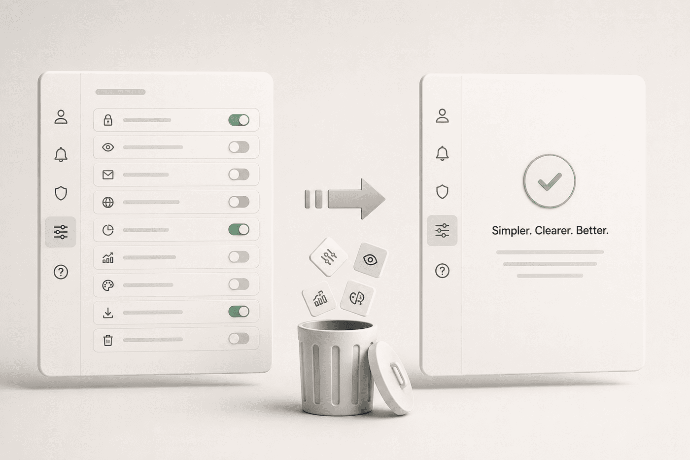
Partnership growth in fintech has a particular shape: it compounds business value quickly and compounds product complexity even faster, and the two curves rarely get reviewed together. Every new partner integration is sold internally as “just another option in the flow,” and each one, taken alone, is a reasonable addition.

The trouble shows up after the fifth or sixth partner, when a user who once had a single clear path now faces a decision the product was never designed to explain: which provider, which rate, which fine print. Nobody chose to build a confusing product. It accumulated, one shipped partnership at a time.

“Every new integration quietly adds a decision the user has to make.”

The fix isn’t to slow down partnerships — the commercial logic behind them is usually sound. It’s to separate the decision the business needs (more optionality, more coverage, more routes to revenue) from the decision the user is being asked to make in the interface. Often that means the product should choose a sensible default on the user’s behalf and expose the alternatives only when they materially matter, rather than surfacing every partner as an equal, unexplained option.

This requires product and business development to share a single view of what’s actually driving outcomes, updated as partnerships are added — not a retrospective UX cleanup once the flow has become unmanageable. The healthiest fintech platforms I’ve worked with review their integration surface on the same cadence they review new partnerships, so the two never drift more than a quarter apart.

The test I use is simple: could someone new to the product explain, in one sentence, why they’re seeing this option instead of another? If the honest answer requires knowing the company’s partnership history, the interface is carrying weight it shouldn’t be carrying, and the fix belongs in the product, not in a longer help article.

Related Posts

Privacy Preference Center